Endangered Languages Project
A platform for communities to document endangered languages and for researchers to explore and verify language data.
- User experience research, Product strategy, UI design, Engineering
The challenge
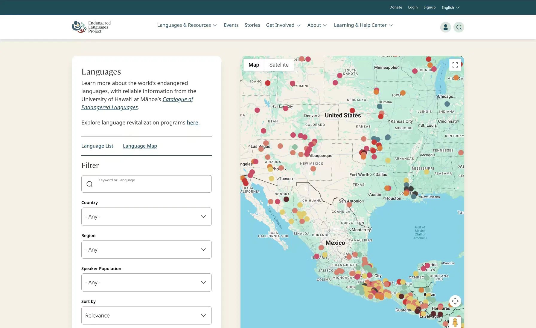
The Endangered Languages Project needed one platform to serve two very different audiences.
For language communities, the platform needed to feel personal and welcoming: a place to share recordings, writing systems, oral histories, resources, and knowledge about a language they cared deeply about. Contributing shouldn’t feel like filling out a database form.
For researchers, the same platform needed to feel structured and trustworthy. They needed to browse information across hundreds of languages, understand the status of each language, compare data, and assess where information came from.
The challenge was designing one experience that could support both cultural ownership and academic rigor without feeling like two separate products stitched together.
Research
Understanding two very different users
We started by looking at existing language, research, and community platforms, then spoke directly with the people who would use and maintain ELP.
We conducted a Typeform survey, followed by 5 stakeholder interviews and 6 user interviews, to understand how different audiences thought about language preservation, research, and contribution.
One of the clearest tensions was around ownership and trust.
Community members wanted their language’s page to feel like a representation of their language and culture rather than a static record in a database. Some also expressed a lack of trust toward outside researchers documenting their language.
Researchers had almost the opposite priorities. They wanted provenance, structure, comparability, and confidence in the data.
These findings gave us a central design challenge:
How can one interface feel personal enough for communities to take ownership of their language, while remaining rigorous enough for researchers to trust the information?
Designing for two audiences
Finding the shared language
The research helped us define three primary user types:
- Community Member. Motivated by pride and preservation; needs simple ways to contribute knowledge, media, and resources.
- Language Researcher. Motivated by data integrity; needs to browse, compare, and verify information.
- Preservation Volunteer. Motivated by contribution; sits between the needs of communities and researchers.
Although their goals were different, they needed to interact with many of the same pieces of information.
That led us to a shared visual language: informative and structured, but approachable enough to feel human. The interface needed to communicate credibility without becoming cold or institutional.
From research to product
Mapping the experience
We mapped the key journeys for each audience to understand where their goals overlapped and where they diverged. That showed us which parts of the product could use shared patterns and which needed to behave differently.
We then translated those findings into user stories and product epics, bringing stakeholders, researchers, and designers into the process to define the functionality the platform needed. Examples included:
- Language Page
- Create a Language
- Contribute Resources
- Explore Language Data
Grouping related user stories into epics gave us a practical framework for moving from research into interface design.
From user stories to wireframes
Testing the language page
The Language Page became one of the most important parts of the experience because it had to satisfy both audiences.
Our early wireframes explored a dense, information-heavy layout designed to make a large amount of language data available in one place. But when we shared those concepts with community reviewers, the feedback was clear: the page felt too “form-like.”
That changed our approach. Rather than treating the language page as a database record, we began treating it more like a living profile of the language and the community behind it.
We introduced clearer hierarchy and more distinct content sections, making the experience easier to scan while giving important cultural and community information more presence.
The goal wasn’t to remove structure. It was to make the structure feel more human.
From prototype to product
We translated the wireframes into high-fidelity designs and developed a live prototype in Webflow, using feedback at each stage to refine the experience.
Once the experience was validated, we built the final platform in WordPress using Gutenberg blocks. That gave the ELP team greater control over the content and structure of the platform, allowing them to update and manage the experience visually without relying on developers for everyday changes.
The result
The result was a single platform that could support two fundamentally different ways of engaging with endangered languages.
Community members could document and share the resources, stories, and knowledge connected to their language, while researchers could explore structured information across hundreds of languages with clearer sourcing and context.
The design brought those needs together through a common interface: structured enough to support research, but personal enough to give communities a sense of ownership.
See it live: endangeredlanguages.com